Trash Bath
澡垃趣- 傳播環保觀念的兒童清洗遊具設計
This is a specially designed bathroom toy that caters to growing children. It transports kids into a fairy tale-like atmosphere in which they learn crucial concepts of ecological preservation through role play.
「澡垃趣」是專為成長發育中的孩童所設計,改良傳統沐浴用的撈水器具,賦予教育性質及健康訓練的目的。 利用鯨魚平衡玩具與撿拾漂浮水面上的「垃圾」造型海綿,帶孩童進入童話故事的情境,透過角色扮演的方式,期望小朋友從小被灌輸正當的海洋環境保育與生態平衡的觀念,是兼顧健康發育與寓教於樂的訓練玩具。
ID Design: Yu-Sheng Chen | Chih-Ti Lee | Shiao-Chun Yu
Pick-ups Working Table
機場接機工作桌設計計畫
Have you ever made an appointment with someone in a place?
Or, have you ever spent a lot of time in seeking and finding your meeting place?
A good and well-organized meeting point should enhance the efficiency between travelers and people who are there to meet them. Simplifying hand-based tasks can increase the efficiency of communication. Based on the results of the study, we designed a work desk that could improve communication and make it efficiently.
Design: Yu-Sheng Chen
屬於島上的資產,保存正在消逝的聲音,透過視覺與聽覺傳達屬於台灣島上特有物種的一種記憶形式。
屬於島上的資產,保存正在消逝的聲音,透過視覺與聽覺傳達屬於台灣島上特有物種的一種記憶形式。
Roll Bucket
能夠透過捲與拉的動作,調整垃圾桶口徑的垃圾桶設計
材質為雙面磁性布,傳統垃圾桶無法適應每種垃圾袋的尺寸,本設計透過拉與捲動的方式讓垃圾桶的口徑可以隨意放大與縮小,並可以將多餘的部分透過磁鐵吸住與固定,增加垃圾袋口與桶口之間的穩定度。
Roll Bucket
能夠透過捲與拉的動作,調整垃圾桶口徑的垃圾桶設計
材質為雙面磁性布,傳統垃圾桶無法適應每種垃圾袋的尺寸,本設計透過拉與捲動的方式讓垃圾桶的口徑可以隨意放大與縮小,並可以將多餘的部分透過磁鐵吸住與固定,增加垃圾袋口與桶口之間的穩定度。
ID Design: Yu-Sheng Chen
ID Design: Yu-Sheng Chen
Trash Bath
澡垃趣- 傳播環保觀念的兒童清洗遊具設計
This is a specially designed bathroom toy that caters to growing children. It transports kids into a fairy tale-like atmosphere in which they learn crucial concepts of ecological preservation through role play.
「澡垃趣」是專為成長發育中的孩童所設計,改良傳統沐浴用的撈水器具,賦予教育性質及健康訓練的目的。 利用鯨魚平衡玩具與撿拾漂浮水面上的「垃圾」造型海綿,帶孩童進入童話故事的情境,透過角色扮演的方式,期望小朋友從小被灌輸正當的海洋環境保育與生態平衡的觀念,是兼顧健康發育與寓教於樂的訓練玩具。
ID Design: Yu-Sheng Chen | Chih-Ti Lee | Shiao-Chun Yu
ID Design: Yu-Sheng Chen | Chih-Ti Lee | Shiao-Chun Yu
ID Design: Yu-Sheng Chen | Chih-Ti Lee | Shiao-Chun Yu
Through the "Negative Space" way to create a pattern belonging to the culture of Taiwan.
Ethan Chen
USER EXPERIENCE DESIGNER
UX Wording Improvement - Empty Page (NowApp
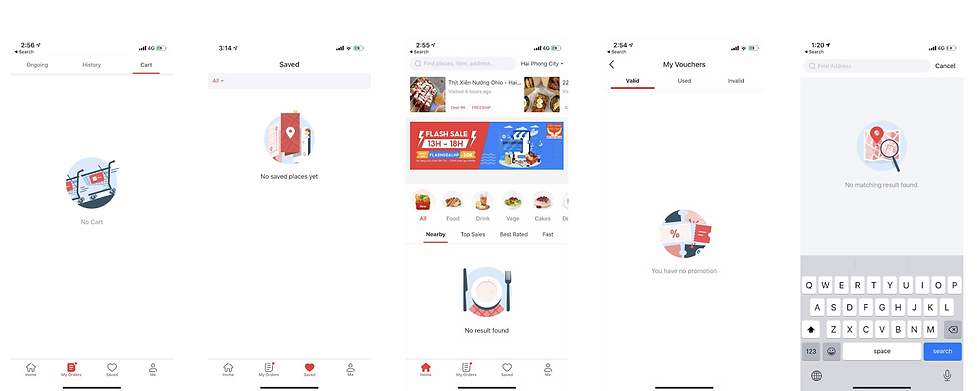
In order to ensure the tone of the statement is consistent and avoid the "No XXX" format for empty status. We established a guideline of UX wording to improve the writing for empty page, as well as to make the wording more appealing and informative.
Period/ Jun 22, 2020 - Aug 5, 2020
Idea planner: Ethan ;
Assistence: Louis (Intern)
Objectives:
1. To ensure that the "tone" of the statement in Now app can be consistent.
2. To avoid using "no XXX" format in the entire app, which is too formal and cannot convey enough useful information to our users.
3. Make sure the description that explains the problem, how it happened, and gives users a solution. If possible educates users about the benefits of the feature.
Final Output:
A guideline of wording that can let designer/PM/marketing to refer to.
The problems (old version of UX writing)

One of the example


