Trash Bath
澡垃趣- 傳播環保觀念的兒童清洗遊具設計
This is a specially designed bathroom toy that caters to growing children. It transports kids into a fairy tale-like atmosphere in which they learn crucial concepts of ecological preservation through role play.
「澡垃趣」是專為成長發育中的孩童所設計,改良傳統沐浴用的撈水器具,賦予教育性質及健康訓練的目的。 利用鯨魚平衡玩具與撿拾漂浮水面上的「垃圾」造型海綿,帶孩童進入童話故事的情境,透過角色扮演的方式,期望小朋友從小被灌輸正當的海洋環境保育與生態平衡的觀念,是兼顧健康發育與寓教於樂的訓練玩具。
ID Design: Yu-Sheng Chen | Chih-Ti Lee | Shiao-Chun Yu
Pick-ups Working Table
機場接機工作桌設計計畫
Have you ever made an appointment with someone in a place?
Or, have you ever spent a lot of time in seeking and finding your meeting place?
A good and well-organized meeting point should enhance the efficiency between travelers and people who are there to meet them. Simplifying hand-based tasks can increase the efficiency of communication. Based on the results of the study, we designed a work desk that could improve communication and make it efficiently.
Design: Yu-Sheng Chen
屬於島上的資產,保存正在消逝的聲音,透過視覺與聽覺傳達屬於台灣島上特有物種的一種記憶形式。
屬於島上的資產,保存正在消逝的聲音,透過視覺與聽覺傳達屬於台灣島上特有物種的一種記憶形式。
Roll Bucket
能夠透過捲與拉的動作,調整垃圾桶口徑的垃圾桶設計
材質為雙面磁性布,傳統垃圾桶無法適應每種垃圾袋的尺寸,本設計透過拉與捲動的方式讓垃圾桶的口徑可以隨意放大與縮小,並可以將多餘的部分透過磁鐵吸住與固定,增加垃圾袋口與桶口之間的穩定度。
Roll Bucket
能夠透過捲與拉的動作,調整垃圾桶口徑的垃圾桶設計
材質為雙面磁性布,傳統垃圾桶無法適應每種垃圾袋的尺寸,本設計透過拉與捲動的方式讓垃圾桶的口徑可以隨意放大與縮小,並可以將多餘的部分透過磁鐵吸住與固定,增加垃圾袋口與桶口之間的穩定度。
ID Design: Yu-Sheng Chen
ID Design: Yu-Sheng Chen
Trash Bath
澡垃趣- 傳播環保觀念的兒童清洗遊具設計
This is a specially designed bathroom toy that caters to growing children. It transports kids into a fairy tale-like atmosphere in which they learn crucial concepts of ecological preservation through role play.
「澡垃趣」是專為成長發育中的孩童所設計,改良傳統沐浴用的撈水器具,賦予教育性質及健康訓練的目的。 利用鯨魚平衡玩具與撿拾漂浮水面上的「垃圾」造型海綿,帶孩童進入童話故事的情境,透過角色扮演的方式,期望小朋友從小被灌輸正當的海洋環境保育與生態平衡的觀念,是兼顧健康發育與寓教於樂的訓練玩具。
ID Design: Yu-Sheng Chen | Chih-Ti Lee | Shiao-Chun Yu
ID Design: Yu-Sheng Chen | Chih-Ti Lee | Shiao-Chun Yu
ID Design: Yu-Sheng Chen | Chih-Ti Lee | Shiao-Chun Yu
Through the "Negative Space" way to create a pattern belonging to the culture of Taiwan.
Ethan Chen
USER EXPERIENCE DESIGNER
ShopeeFood
Finding Inspiration in Every Turn
From August 18, 2021, the Now app has appearred in a completely new look and rebranded as ShopeeFood - an app that serves customers in ordering and delivering food in big cities in Vietnam.
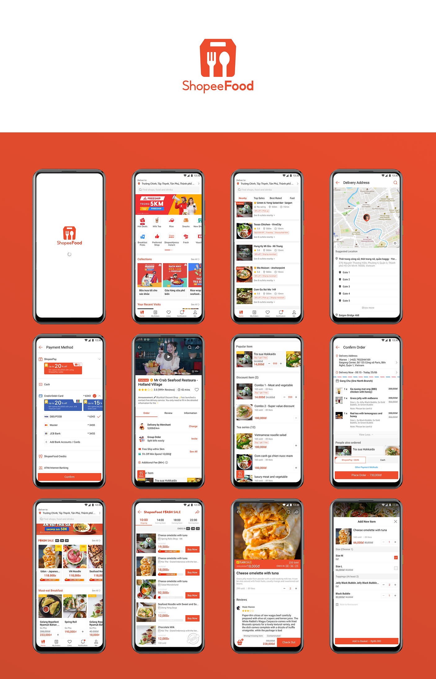
Highlights
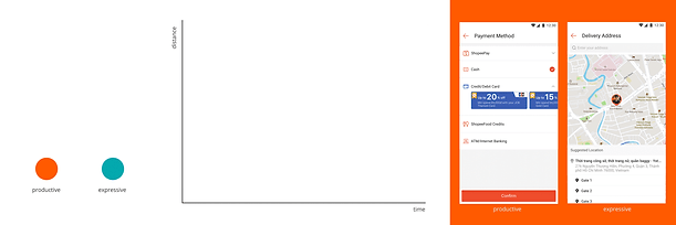
ShopeeFood Motion Design
As our business become bigger, we have more use cases to handle, so it’s growing the inconsistency and increasing the maintenance cost.
And we don’t have the guidance regarding motion, so I propose to start to run a design system for motion design.


Some animations cases
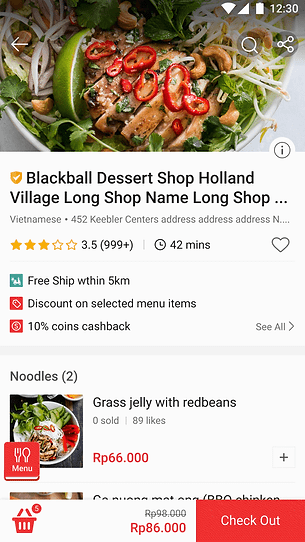
Menu - Page turning effects
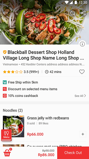
Attraction: Since some users feedback that they couldn't find the menu button. So I tried some animated effects on the component to catch the user's eyes, especially for the first time visit users, which can be a compelling and fun way to interact with the users.
Users will see the menu move in from the left side when entering this page, will see the effect after clicking on the menu button.

Option1: flat style without moving the book

Option2 : flat style and book is moving while page turning
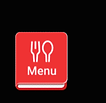
Option3 : 3D style and book is moving while page turning (preferred option)
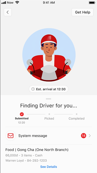
Ongoing order _ Finding driver animation

Video Player & Dynamic Popup Banner
Background: The CTR (Click through rate) on “Popup banner” is much higher than all the other banners, so the local ops&market wanna have more use cases on this banner type. We tried different combinations of dynamic banners. We hope that the operation team can have more modules that can be applied to advertising
Data findings: The animation on home circle buttons got higher CR. We considered to leverage this findings to make our landing popup "dynamics" so that we can gain more traffic from this component.
Period/ Jul, 2020 Designer/ Ethan (IA, guideline, wireframing, UI/UX logic and data research)
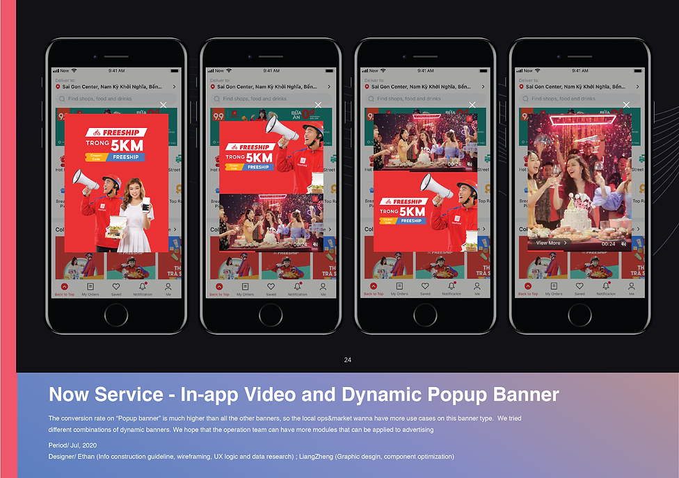
Dynamic Popup Banners
Data Analysis - Key findings
According to the CTR ranking (calculated by PV or by UV), we found that the section of the popup banner is much higher than other banners, which means we can put more effort into advertising from popup banner or explore more types/ideas on this banner.
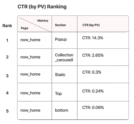
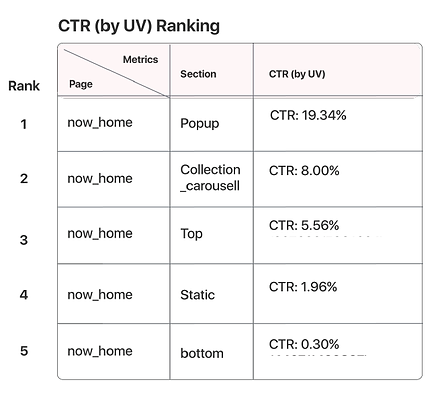
Data Analysis
I calculated the percentage of how many users see the banners and click on it in the end. And analyzed the frequency of the usage of each banners. Then we can make sure if this design requirement worth us to do, and we also found out that the dynamic icon on home circle can increase the clicks rate, so we consider to leverage this findings to the banners design.
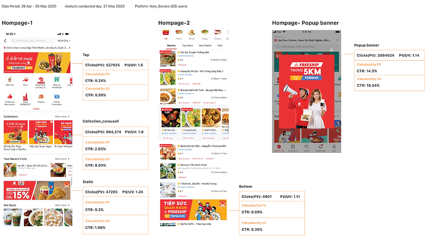
Challenges
Challenges:
We came up with several cases for applying this in-app video and dynamic ads. At first, we were not sure if the operations team will follow these design modules and afraid to display the unmatch and inconsistenct view for users.
How to solve:
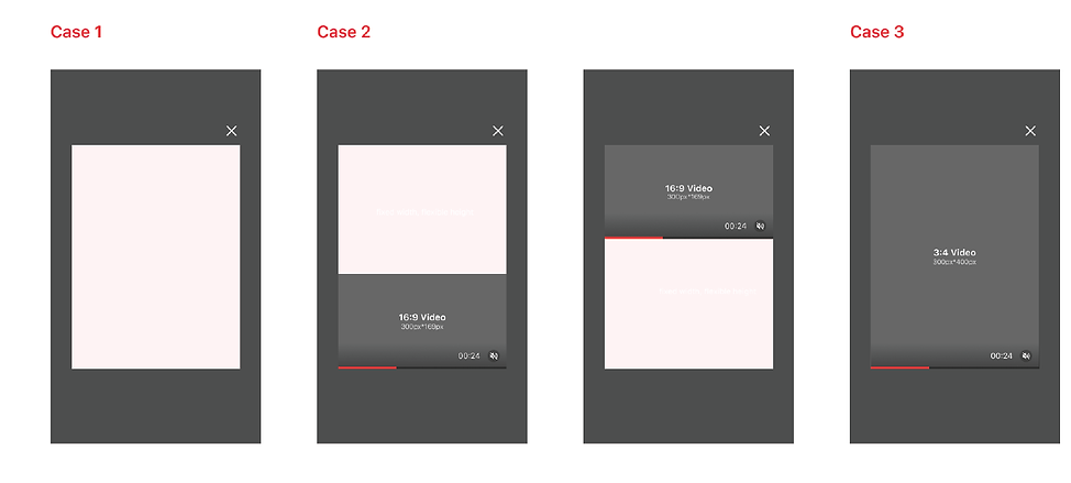
So we provide the strict rules and guideline for logic and format. Hope the local market/ops teams could follow this rules.
Wireframes of each use cases
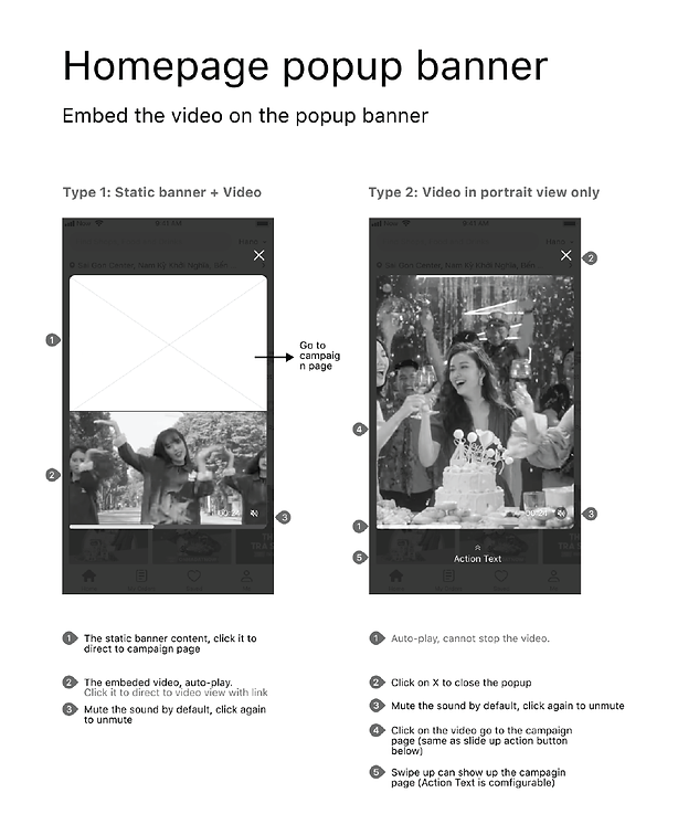
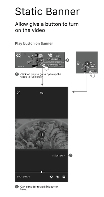
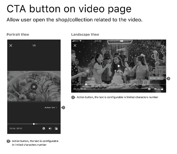
We finally developed 4 Types of popup banners
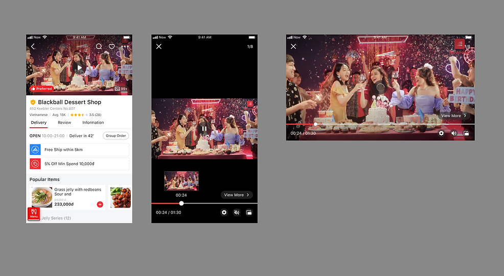
In-app Video Player
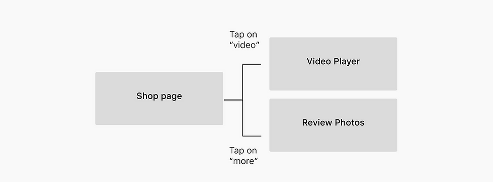
User Flow
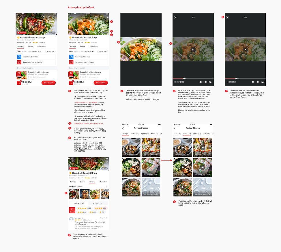
Design Guideline
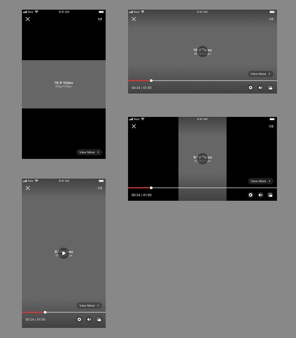
UI Design
